






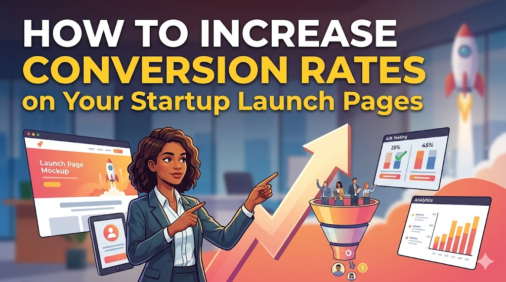
Your startup's website has one job: turn interested visitors into early adopters, waitlist sign-ups, or paying customers. A "conversion" is the specific action you want a visitor to take. Driving traffic from platforms like Product Hunt or Google Ads is only half the battle; the real win is converting that attention into tangible results.
Conversion Rate Optimization (CRO) is the systematic process of improving your website to maximize the percentage of visitors who take that desired action. Even small improvements can lead to significant gains. Increasing your conversion rate from 2% to 3% is a 50% increase in customers from the same amount of traffic.
This guide provides a founder-focused framework for boosting your conversion rate, covering foundational principles and actionable strategies to build the momentum your startup needs.
Top Ways to Increase Conversion Rate:
- Clarify your value proposition: Instantly answer "What is this?" and "Why should I care?"
- Build trust with social proof: Use testimonials, reviews, and data to reduce skepticism.
- Simplify forms: Remove every unnecessary field to reduce friction.
- Use a single, clear CTA: Guide users toward one primary goal.
- Optimize for speed and mobile: Ensure your site is fast and flawless on all devices.
- A/B test your assumptions: Use data, not guesses, to make decisions.
What is a Conversion Rate? (And How to Calculate It)
Before you can improve your conversion rate, you need to understand what it is and how to measure it.
Your conversion rate is the percentage of visitors to your website who complete a desired goal (a "conversion") out of the total number of visitors. The goal can be anything from making a purchase to signing up for a newsletter or booking a demo.
How to Calculate Your Conversion Rate
The formula for calculating conversion rate is simple:
(Number of Conversions / Total Number of Visitors) x 100 = Conversion Rate
For example, if your landing page had 1,000 visitors in a month and 50 of them signed up for your waitlist, your conversion rate would be:
(50 / 1,000) x 100 = 5%
Tracking this core metric is the first step in understanding how well your page is performing and identifying opportunities for improvement.
1. Nail Your Value Proposition Above the Fold
The first five seconds a visitor spends on your page are the most critical. Your value proposition—communicated through a headline, sub-headline, and hero image—must instantly answer "What is this?" and "Why should I care?". If it's vague, visitors will bounce before you get a chance to persuade them.
- Craft a Clear, Benefit-Driven Headline: Focus on the outcome for the user, not just the features of your product. Instead of "AI-Powered Task Management," try "Reclaim 10 Hours a Week with an AI Assistant That Manages Your Tasks."
- Use a Sub-headline for Elaboration: Add a single sentence below the main headline to provide more context or target a specific audience. For example: "The smart to-do list for busy founders and product teams."
- Show, Don't Just Tell, with a Hero Image: Use a high-quality product screenshot, a short GIF of the product in action, or an image that evokes the positive outcome your product delivers.
- Make Your Primary CTA Obvious: Your main call-to-action button should be immediately visible without scrolling, using a color that contrasts with the background.
- Workflow: The 5-Second Test: Show your page to someone in your target audience for five seconds, then hide it. Ask them to explain what your product does and who it's for. If they can't, your value proposition isn't clear enough.
2. Build Unshakeable Trust with Social Proof
For a new startup, you're an unknown entity asking for a visitor's email address or credit card number. You need to overcome inherent skepticism by borrowing credibility from others. Social proof validates your idea and reassures visitors that they aren't the first to take a risk on you.
- Showcase Early Testimonials: Feature quotes from beta testers or early users. Including their name, company, and photo adds a layer of authenticity.
- Display "As Seen On" Logos: If your startup has been mentioned on any tech blogs or news sites, display their logos prominently.
- Use Numbers as Proof: Be specific. "Join 5,000+ founders on the waitlist" is more powerful than "Join our community."
- Highlight Founder Credibility: Briefly mention relevant experience that builds authority (e.g., "Built by former engineers from Google & Slack").
- Use Trust Badges: If you're processing payments, display security badges (e.g., SSL certificates, McAfee SECURE, Norton Secured) to reduce purchase anxiety.
3. Simplify and Streamline Your Lead Capture Form
Every additional field you ask a user to fill out is another opportunity for them to abandon the process. For a startup focused on lead generation or sign-ups, the goal is to make conversion as frictionless as possible.
- Ask for the Bare Minimum: For a waitlist, a single email field is all you need. Instead of asking for "First Name" and "Last Name," just capture the email. You can always ask for more information later.
- Use a Single-Column Layout: This creates a clear, linear path for the user to follow, which is especially important on mobile.
- Provide Clear Error Messaging: If a user makes a mistake, clearly indicate which field is wrong and why (e.g., "Please enter a valid email address") in real-time.
- Consider Social Logins: Allowing users to sign up with one click using their Google, GitHub, or LinkedIn account can significantly increase form completions.
4. Craft a Single, Focused Call-to-Action (CTA)
Decision paralysis is a conversion killer. When you present a visitor with too many options—"Sign Up," "Request a Demo," "Learn More," "Follow us on Twitter"—they often choose none. Your page should be a focused machine, guiding every visitor toward one primary goal.
- Use Action-Oriented Language: Your button text should describe what the user will get. "Get My Free Account" is often more compelling than "Create an Account." "Start Building" is better than "Submit."
- Create Visual Contrast: Your CTA button should be the most visually prominent element on the page. Use a bold, high-contrast color that stands out from your brand's primary color palette.
- Place it Logically: Put your CTA above the fold and repeat it after key sections of your page so the user never has to hunt for it.
- Eliminate Competing CTAs: Remove or de-emphasize secondary links (like social media icons or blog links) that could distract a user from the main conversion goal. A simple, low-contrast text link in the footer is often sufficient.
5. Leverage Data with A/B Testing
The most successful startups don't guess what works; they test. A/B testing is a data-driven process that helps you make informed decisions to improve conversions.
What is A/B Testing?
A/B testing involves creating two (or more) versions of your page—a control (Version A) and a variation (Version B)—and showing them to different segments of your traffic to see which one converts better. Even small changes to a headline or CTA button can lead to significant lifts.
