
A high-converting Lead Generation Landing Page is a single, focused web page designed to do one thing: capture a visitor's contact information (a lead) in exchange for something of value. This page is the engine for building an audience, qualifying interest, and securing crucial first users.
The best examples eliminate distractions like site navigation to guide the user toward one specific goal. Think of it like a specialist doctor versus a general practitioner. Your homepage is the GP, offering a bit of everything. Your landing page is the specialist, focused on a single conversion. This direct approach makes the decision to sign up much easier.
This guide breaks down the essential elements, showcases high-converting examples from leading companies, and provides actionable best practices you can apply today.
The Anatomy of a High-Converting Lead Generation Page
Before we dive into the examples, let's dissect the core components that make them work. Nearly every successful lead generation page combines these five elements to build trust and drive action.

- Compelling Headline: The headline is your first and only chance to grab attention. It must clearly state the value proposition and resonate with the visitor's problem.
- Hero Shot or Video: A high-quality image or short video that shows the product, service, or the desired outcome. For a lead magnet, this could be a mockup of the ebook or a GIF of the template in use.
- Clear Value Proposition & Supporting Copy: A concise explanation of the benefits the user will receive by converting. Bullet points are excellent here for scannability, highlighting key features or outcomes.
- Social Proof: Elements that build trust and credibility. This includes customer logos, testimonials, case study results, star ratings, or the number of people who have already signed up.
- Frictionless Form & Call-to-Action (CTA): The form should be simple, asking only for essential information. The CTA button must be prominent, using action-oriented language (e.g., "Get the Free Guide" instead of "Submit").
5 High-Converting Lead Generation Landing Page Examples
The right approach depends on your goal. A pre-launch startup needs to build a waitlist, while a B2B SaaS company needs to book qualified demos. Let's break down five proven models with real-world examples.
1. The B2B Demo Request Page: Slack
This is a classic revenue-driving page. The goal is to convert interest from a potential business customer into a scheduled sales call or personalized demo. Every element is designed to build trust and prove ROI.
- Why It Converts:
- High-Trust Headline: The headline is direct and benefit-oriented, often focusing on solving a major business pain point like productivity or collaboration.
- Massive Social Proof: Slack prominently displays logos of well-known enterprise clients ("Trusted by companies all over the world"). This immediately tells a visitor that they are in good company and reduces perceived risk.
- Minimal Form Friction: The form asks for essential qualifying information (work email, company, job title) but doesn't overwhelm the user.
- Clear, Contrasting CTA: The call-to-action button stands out visually and uses clear language like "Talk to Sales," leaving no doubt about the next step.
2. The Lead Magnet Download Page: HubSpot
This page offers a valuable resource—an industry report, a whitepaper, or a free template—in exchange for an email address. It's a classic inbound marketing strategy to attract potential customers who aren't yet ready for a sales conversation.
- Why It Converts:
- Value-Packed Offer: The lead magnet itself solves a real problem. HubSpot is a master at creating comprehensive guides and templates that their target audience of marketers and salespeople desperately need.
- Visual Representation: They always include a professional mockup of the guide or resource. This makes the intangible digital download feel tangible and more valuable.
- Benefit-Driven Bullet Points: The copy quickly summarizes what the user will learn or achieve with the download, using bullet points for easy scanning.
- Optimized Form: The form is clear and sets expectations about what will happen after submission (e.g., "Get your free guide instantly").
3. The Free Trial Sign-Up Page: Shopify
The goal of a free trial page is to get the user into the product as seamlessly as possible. It removes barriers by deferring payment information and focuses on the single action of starting the trial.
- Why It Converts:
- Zero-Risk Offer: The headline and CTA emphasize that the trial is "free" and that "no credit card is required." This removes the biggest point of friction for potential users.
- Single-Field Simplicity: The initial ask is just one thing: an email address. This ultra-low-friction approach maximizes the number of people who start the process. Shopify collects more information in subsequent steps after the user has already committed.
- Benefit Reinforcement: The page includes a few key benefits or features, reminding the user why they should start a trial (e.g., "Sell online, in person, and everywhere in between").
- Social Proof Through Scale: Mentioning the millions of businesses powered by Shopify serves as powerful social proof that reinforces the platform's credibility.
4. The Pre-Launch Waitlist Page: Robinhood (Early Version)
This page is designed to capture interest and build an audience before a product is live. The goal is to create exclusivity and anticipation, validating market demand before a full launch.
- Why It Converts:
- Powerful, Disruptive Headline: Robinhood's original headline attacked a clear enemy ($10 trading fees). It promised a specific, highly desirable outcome that was easy to understand.
- Exclusivity and Urgency: The "Join the Waitlist" CTA implies scarcity and gives early adopters a feeling of being insiders.
- Built-in Viral Loop: The real genius was on the thank-you page. After signing up, users were shown their place in line and given a unique referral link. Sharing the link moved them up the queue, turning early users into an active marketing force.
- Minimalism: The page had no distractions. It was a headline, a sentence of copy, and a form field. This laser focus made the desired action incredibly clear.
5. The Webinar Registration Page: Salesforce
Webinars are a key lead generation tactic for B2B companies. The landing page must convince a busy professional to give up an hour of their time in exchange for valuable knowledge.
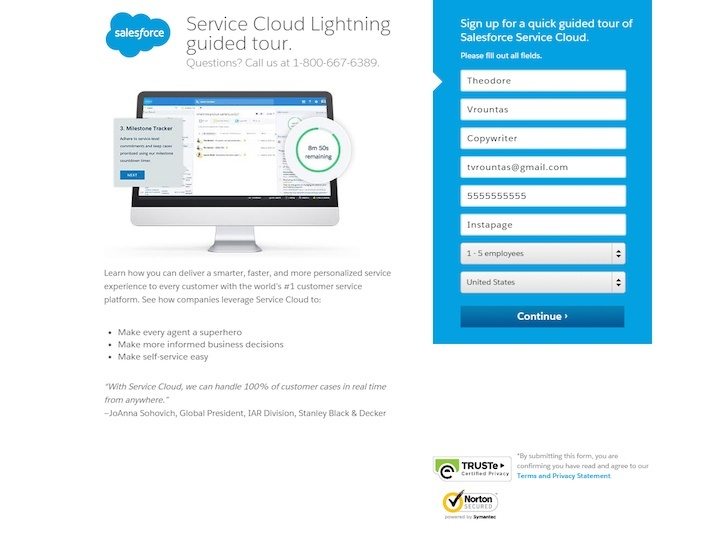
- Why It Converts:
- Speaker Credibility: The page prominently features the speakers, including their photos, titles, and company logos. This builds authority and assures visitors they will be learning from experts.
- Specific Learning Outcomes: Instead of a vague topic, the page uses bullet points to list exactly what attendees will learn ("You'll learn how to..."). This helps potential attendees justify the time commitment.
- Urgency and Scarcity: The event has a specific date and time, creating natural urgency. Phrases like "Save your spot" imply that availability may be limited.
- Clear Logistics: The date, time, and duration are clearly displayed, often in the visitor's local time zone, removing any confusion.
Comparison of Lead Generation Page Types
| Page Type | Primary Goal | Ideal For | Key Element | Common Traffic Channel |
|---|---|---|---|---|
| B2B Demo Request | Generate Sales Leads | B2B SaaS Companies | Social Proof & ROI | LinkedIn Ads, Google Ads |
| Lead Magnet Download | Nurture Top-of-Funnel | Content-Heavy Businesses | High-Value Content | SEO, Content Marketing |
| Free Trial Sign-Up | Product Adoption | SaaS & B2C Products | Zero-Risk Offer | Direct & Paid Traffic |
| Pre-Launch Waitlist | Build Hype & Audience | Pre-Product Startups | Exclusivity & Scarcity | Social Media, PR |
| Webinar Registration | Educate & Qualify Leads | B2B & High-Consideration B2C | Expert Authority | Email Marketing, Social Ads |
Lead Capture Page Best Practices
Whether you're building a waitlist or a demo page, a few rules always apply.
- One Page, One Goal: Every element—every word, every image—should drive the user toward a single CTA. Remove navigation, footer links, and anything else that could distract them.
- Message Match: Ensure your landing page headline and content perfectly match the ad or link the visitor clicked to get there. This seamless transition reassures them they're in the right place.
- Frictionless Forms: Only ask for what you absolutely need. For a content download, a work email might be enough. For a demo request, you may need more qualifiers like company size or job role, but keep it as brief as possible.
- Benefit-Oriented CTA: Ditch "Submit." Use action-packed copy that completes the sentence "I want to...". For example, "Get My Free Template" or "Request a Demo."
- Above-the-Fold Clarity: Your value proposition and CTA button must pass the "5-second test." Can a new visitor understand what you do and what you want them to do in five seconds without scrolling?
- A/B Test Everything: Don't guess what works. Data might prove a different headline converts 30% better. Continuously test your headlines, copy, CTAs, and images to find the winning combination.
Common Landing Page Mistakes to Avoid
- Too Many Choices: The most common mistake is including a navigation menu or multiple competing CTAs. This violates the "One Page, One Goal" rule and kills conversion rates.
- Vague Value Proposition: If a visitor can't understand what you offer and why it's valuable within a few seconds, they will leave. Avoid jargon and focus on clear outcomes.
- High-Friction Forms: Asking for a phone number or annual revenue on a form for a simple newsletter is a great way to get zero sign-ups. Match the number of form fields to the value of your offer.
- Lack of Trust Signals: Without testimonials, customer logos, or other forms of social proof, you're asking visitors to take a leap of faith. Most won't.
- Poor Mobile Experience: A significant portion of your traffic will come from mobile devices. If your page is slow to load or difficult to navigate on a small screen, you're losing leads.
What Launched Today is a discovery platform for new startups. It allows founders to launch their product to reach thousands of other makers and founders and get a DR 49 backlink. Visitors can discover the latest, archived, and trending startups. Explore more at https://whatlaunched.today.
Frequently Asked Questions (FAQ)
What are the most effective lead magnets?
The most effective lead magnets solve a specific, urgent problem for their target audience. Practical, high-value assets work best. Examples include:
- Checklists ("The 20-Point SEO Launch Checklist")
- Templates (a pitch deck template, a financial model spreadsheet)
- A free micro-tool or calculator
- An exclusive industry report with original data.
What is a good lead generation conversion rate?
While industry benchmarks vary wildly, a good starting goal for a new lead generation landing page is 5-10%. According to industry data, median conversion rates often hover around 4% to 7%, so consistently hitting double digits is a strong signal that your offer and page are well-aligned with your audience.
Can I build a high-converting landing page for free?
Absolutely. Many modern platforms offer free landing page builders with robust features. These tools provide professional templates and intuitive drag-and-drop editors, allowing you to create and launch polished, mobile-responsive pages without writing a single line of code.
How is a lead generation page different from a sales page?
A lead generation page has the singular goal of capturing contact information. Its CTA is usually "Download," "Sign Up," or "Request a Demo." A sales page has the goal of making a direct sale. Its CTA is "Buy Now" or "Add to Cart," and it typically involves a payment transaction.